FontAwesome.Sharp

A library for embedding Font Awesome icons in WPF & Windows Forms applications via NuGet. Inspired by ioachim/fontawesome.wpf (BitBucket) and Using Font Icons (CodeProject).
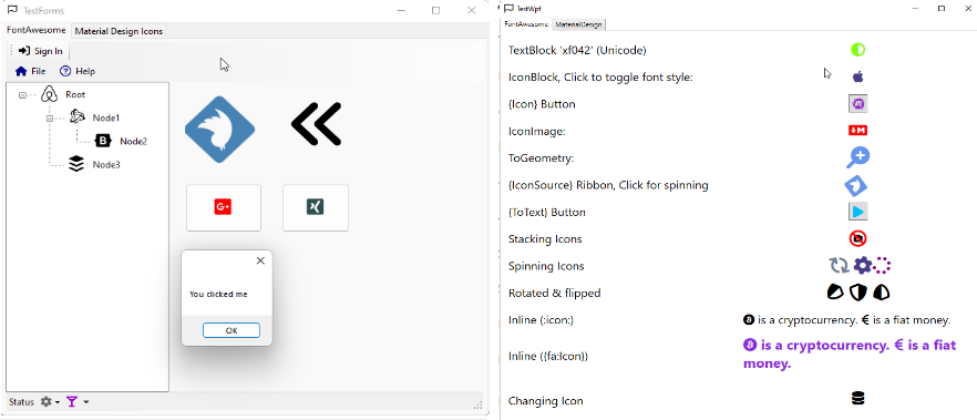
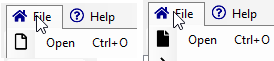
Here is a screenshot from the sample applications
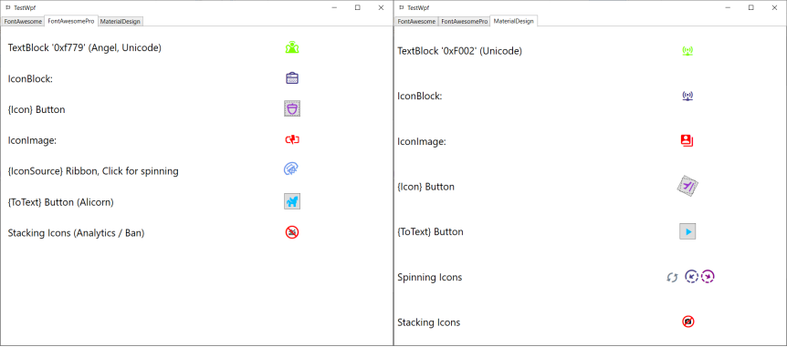
Here is a screenshot from the WPF sample application show-casing using also other icon fonts like
- FontAwesome Pro and
- MaterialDesign:
Don't miss out the community tutorials on YouTube, e.g.
- RJ Code Advance EN: C#/ Modern Flat UI + Font Awesome Icons, Multicolor, Highlight button, WinForm
- RJ Code Advance EN: VB/ Form Moderno + Iconos Font Awesome, Multicolor, Resaltar botón, WinForm-Visual Basic .NET
How to
- Installation
- Use with WPF
- Use with Windows Forms
- Use Font Awesome Pro
- Use custom fonts other than Font Awesome, e.g. Material Design Icons
See also
Installation
Add the NuGet package to your WPF or Windows Forms application or library.
Windows Forms
For Windows Forms projects use the subclasses
IconButton,IconToolStripButton,IconDropDownButton,IconMenuItem,IconPictureBoxorIconSplitButton,
respectively.
If you just want to generate a bitmap for an icon, use the ToBitmap()/ToImageSource-extension like this
var bitmap = IconChar.BatteryEmpty.ToBitmap(16, Color.Black); // Windows Forms
var image = IconChar.BatteryEmpty.ToImageSource(Brushes.Black, 16); // WPF

var customFontBitmap = MyCustomFont.ToBitmap(MyEnum.SomeIcon, 16, Color.Black); // Windows Forms, custom font
var customFontImage = MyCustomFont.ToImageSource(MyEnum.SomeIcon, Brushes.Black, 16); // WPF, custom font
For more details including setting the application icon or using a treeview, have a look at the sample application TestForms.
WPF
After installation, add the XAML namespace and you are good to go
<Window
  xmlns:fa="http://schemas.awesome.incremented/wpf/xaml/fontawesome.sharp">
...
</Window>
If you use WPF you may remove the references to
System.Windows.FormsSystem.Drawing
You can add iconic items to your views in the following ways
<TextBlock />using the FontAwesome font family directly,<IconBlock />,{fa:Icon [Icon]},{fa:ToText [Icon]},{fa:Geometry [Icon]},<fa:IconImage />,{fa:IconSource [Icon]}<fa:IconToImageConverter />
More details are given below. Be sure to have a look at the sample application TestWpf.
Text
The most rudimentary way is to use FontAwesome directly with a TextBlock like
<TextBlock Grid.Column="1" Text=""
FontFamily="/FontAwesome.Sharp;component/fonts/#Font Awesome 6 Free Solid"
Foreground="Chartreuse"
TextAlignment="Center" />
However, you need to have the FontAwesome Cheatsheet on your knees to know the icons correct unicodes.
Note: Since fontawesome 5+, the brand icons have been moved to a separate brands fonts. So you are better off using the following components which take care of auto-selecting the font for the respective icon.
Inline text
As of v4.6.3 inline parsing was added (#2), thx to @furesoft for the nice idea. Here is an example
<TextBlock fa:Awesome.Inline=":Bitcoin: is a cryptocurrency. :EuroSign: is a fiat money." />
Usually, you will bind some text from your view model, say
<TextBlock fa:Awesome.Inline="{Binding MyInlineText}" />
where MyViewModel.MyInlineText may be some text like ":Bitcoin: is a cryptocurrency. :EuroSign: is a fiat money.".
This works by creating inline Runs switching fonts to FontAwesome while preserving
all other font related properties of the TextBlock like color, weight and size.
The default RegEx pattern for parsing the icon names is :(\w+):.
It can be customized using the Awesome.Pattern-property. Any pattern with the first group matching the icon name (case insensitive) should work. An example:
<TextBlock fa:Awesome.Pattern="{}{fa:(\w+)}"
    fa:Awesome.Inline="{}{fa:Bitcoin} is a cryptocurrency. {fa:EuroSign} is a fiat money."
    />
Note that in Xaml you should declare the Pattern-property before the Inline-property.
<fa:IconBlock />
To use FontAwesome-icons in text you can use the IconBlock which subclasses the standard WPF TextBlock. You can the set the corresponding Font Awesome icon via the Icon-property:
<fa:IconBlock Icon="Home" Foreground="Blue" />
Buttons
The most typical use case for icons is buttons. Of course you can use IconBlock with element-style syntax:
<Button>
    <Button.Content>
        <fa:IconBlock Icon="Info" Foreground="Chocolate"/>
    </Button.Content>
</Button>
However, this is awfully long code for just having an icon.
{fa:Icon [Icon]}
the Icon markup extension allows for a shorthand notation to create an IconBlock using the attribute syntax:
<Button Content="{fa:Icon InfoCircle, Foreground=Chocolate}"/>
{fa:ToText [Icon]}
Using the ToText markup extension is most recommended when using the font. It translates an IconChar to a string capturing the icon´s unicode. Here is an example
<Button Content="{fa:ToText Play}" />
And here a default style
<Style TargetType="Button">
    <Setter Property="FontFamily" Value="/FontAwesome.Sharp;component/fonts/#Font Awesome 6 Free Solid"/>
    <Setter Property="FontSize" Value="18" />
    <Setter Property="VerticalAlignment" Value="Center"/>
    <Setter Property="HorizontalAlignment" Value="Center"/>
    <Setter Property="Margin" Value="4" />
    <Setter Property="Padding" Value="4" />
    <Setter Property="Width" Value="32" />
    <Setter Property="Height" Value="32" />

    <Setter Property="Foreground" Value="DeepSkyBlue"/>
    <Style.Triggers>
        <Trigger Property="IsMouseOver" Value="True">
            <Setter Property="Foreground" Value="LightSkyBlue"/>
        </Trigger>
    </Style.Triggers>
</Style>
Note: Since fontawesome 5+, the brand icons have been moved to a separate brands fonts. Try avoiding to hardcode the font family name unless you know all icons used with the style are contained in the font.
Images
<fa:IconImage />
Use this control when you are restricted to images and cannot use IconBlock.
It subclasses the standard WPF Image
for convenience. Again, you can set the corresponding Font Awesome element via the Icon-property like this
<fa:IconImage Icon="Ambulance" Foreground="Red" Width="24" Height="24"/>
You can additionally change the color with the Foreground-property.
ImageSource (RibbonButton)
{fa:IconSource [Icon]}
When you are restricted to ImageSource like with the WPF Ribbon
control you can use the IconSource markup extension like:
<RibbonButton SmallImageSource="{fa:IconSource InfoCircle, Foreground=Red}"/>
Menus and MVVM
For MenuItem you want to set the Icon property via an <fa:IconImage />. However, in MVVM scenarios you want to bind the icon of a view-model to the menu item. This can be done with the IconToImageConverter like this
<Window.Resources>
    <fa:IconToImageConverter x:Key="IconToImage"/>
</Window.Resources>
<Window.ContextMenu>
    <ContextMenu>
        <MenuItem Command="Open" Icon="{Binding Icon, Converter={StaticResource IconToImage}}"/>
    </ContextMenu>
</Window.ContextMenu>
where the view model looks like this
public class MainViewModel
{
    public IconChar Icon { get; set; }
}
and the window DataContext is initialized for instance like this
public partial class MainWindow
{
    public MainWindow()
    {
        InitializeComponent();

        DataContext = new MainViewModel {Icon = IconChar.Apple};
    }
}
Styling the converted menu images
Often you want to have the menu icons all have a consistent style (e.g. size and foreground). To achieve this you can configure the IconToImageConverter like this
<Brush x:Key="FaBrush">DarkOrchid</Brush>
<Style TargetType="Image" x:Key="FaImageStyle">
    <Setter Property="Width" Value="20"/>
    <Setter Property="Height" Value="20"/>
</Style>
<fa:IconToImageConverter x:Key="IconToImage"
    Foreground="{StaticResource FaBrush}"
    ImageStyle="{StaticResource FaImageStyle}"/>
Using FontAwesome Pro
To use your licensed version of Font Awesome Pro just add the respective TrueType font files as embedded resources.
NOTE: The prebuilt package FontAwesome.Sharp.Pro contains only the generated icon-Enumerations
ProIconsDuoToneIcons
See the TestWPF sample application for an example on how to use icons from Font Awesome Pro.
They have been generated from the css-Definitions like any other Custom font (see below):
$ FontEnumGenerator.exe --css Content\all-pro.css --namespace FontAwesome.Sharp.Pro --name ProIcons
Parsed 4613 Enum values (1014 duplicates).
Matched 4613 icons from 'Content\all-pro.css' using '\.fa.(.+):before'
Generated 'ProIcons.cs'.

$ FontEnumGenerator.exe --css Content\duotone-pro.css --pattern "\.fad.fa-(.+):after" --namespace FontAwesome.Sharp.Pro  --name DuoToneIcons
Parsed 4114 Enum values (980 duplicates).
Matched 4114 icons from 'Content\duotone-pro.css' using '\.fad.fa-(.+):after'
Generated 'DuoToneIcons.cs'.
The actual fonts are
Using custom fonts
As of version 5.2+ it is easy to reuse the library with other icon fonts (see e.g. Vector Icons Roundup for a comparative list).
See the TestWPF or the TestForms sample application for an example on how to use Material Design Icons.
The steps to use your own icon font are laid out below with Google's Material Design Icons as an example:
- Download the web font, e.g. Templarian/MaterialDesign-Webfont. You will need the
.cssand the.ttffiles. Alternatively use the npm font package @mdi/font - Generate the font icon enum class using
FontEnumGenerator
$ FontEnumGenerator.exe --css Content\materialdesignicons.css --pattern "\.mdi-(.+):before" --name MaterialIcons
Matched 5345 icons from 'Content\materialdesignicons.css' using '\.mdi-(.+):before'
Generated 'MaterialIcons.cs'.
This will parse the .css file and generate an enumeration class MaterialIcons.cs with the UTF8-codes of all css-items matching the specified prefix .mdi-*-before, cf.
 .mdi-access-point:before {
 content: "\F002";
 }

 .mdi-access-point-network:before {
 content: "\F003";
 }
 ...
 public enum MaterialIcons
 {
     None = 0,
     AccessPoint = 0xF002,
     AccessPointNetwork = 0xF003,
     ...
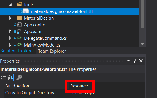
- Add the generated class and the font file (
.ttf) to your project. Check thatBuild Actionis set toResourcefor the font file.
- Load the font and declare icon classes using the enum and the corresponding font.
internal static class MaterialDesignFont
{
    internal static readonly FontFamily FontFamily =
        Assembly.GetExecutingAssembly().GetFont("fonts", "Material Design Icons");
}
...
public class IconBlock : IconBlockBase<MaterialIcons>
{
    public IconBlock() : base(MaterialDesignFont.FontFamily)
    {
    }
}
...
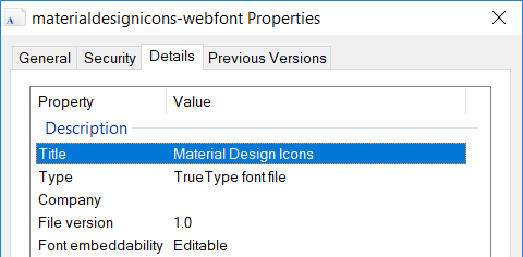
You can find the font title by inspecting the File properties.
- Use your custom classes, e.g. with Xaml
<Window x:Class="TestWpf.MainWindow"
    ...
    xmlns:mdi="clr-namespace:TestWpf.MaterialDesign">
    ...
    <mdi:IconBlock Icon="AccessPointNetwork" FontSize="24" Foreground="DarkSlateBlue" />
    ...
which will look like this

Related Projects
Other libraries for using FontAwesome in Windows applications that we know of and are available on NuGet:
- FontAwesome.Portable: Great idea to make it a portable library. However, we could not find the source repository.
- charri/Font-Awesome-WPF: Clean and nice implementation. Icon metadata and spinning support are really cool.
- FontAwesome-WindowsForms: An example implementation for Windows Forms. We adapted this for FontAwesome.Sharp.4.4.0.
In production, however, we needed to support
- Ribbons using ImageSource (not only Image),
- MVVM with Icon enum (smaller memory footprint on the viewmodel than Image),
- more markup extensions to keep the Xaml compact
- and finally
Windows.Formsas well.
FAQ
How does it work?
Rendering Glyph Fonts / Font icons basically works by looking up the Glyph-symbols from the respective fonts using their Unicode and drawing them as text.
In the Web this has been a simple and effective design option for quite a long time. However, for most Desktop application frameworks there is no or only little support.
The way we support icon fonts in Desktop Application Frameworks like WPF and Windows Forms is by
- Embedding the TrueType (.ttf) as Embbedded Resources,
- Generating Enumeration types from the web glyph definitions (usually in CSS) and
- Providing Interop-code between Text-Rednering and the UI-Primitives of the Desktop Application Framework.
Windows Forms Designer: I cannot find any controls in the Toolbox
Add the controls to the toolbox as described in this SO answer: How do I add my new User Control to the Toolbox or a new Winform?
Note that with recent NuGet versions you will usually find installed NuGet packages in %USERPROFILE%\.nuget\packages.
My Windows Forms application gets rescaled once a FontAwesome-item is created
Windows 10 (.NET 4.7+) you can enable DPI awareness in your windows forms application by adding
<System.Windows.Forms.ApplicationConfigurationSection>
  <add key="DpiAwareness" value="PerMonitorV2" />
</System.Windows.Forms.ApplicationConfigurationSection>
to your app.config. For more information see
All icons seem to be rendered with Regular style. How to render solid or brand icons
In fontawesome, regular and solid icons use different font/ttf-files. Since regular/solid have overlapping icons and regular is the first font in the list the glyphs in the regular-font will be preferred.
As of 5.15+ the font style can be explicitly set, e.g.
this._openMenuItem.IconChar = FontAwesome.Sharp.IconChar.File;
this._openMenuItem.IconFont = IconFont.Solid;
this._openMenuItem.Name = "_openMenuItem";
To render an icon directly to a bitmap using a specific font style
var bitmap = IconChar.GoogleDrive.ToBitmap(IconFont.Brands);